PROJECT:
I.Stamatopoulos
ELECTRICIAN
MAIN:
Logo Design

BRAINSTORMING:
Color palette
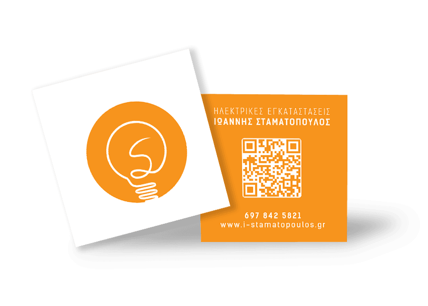
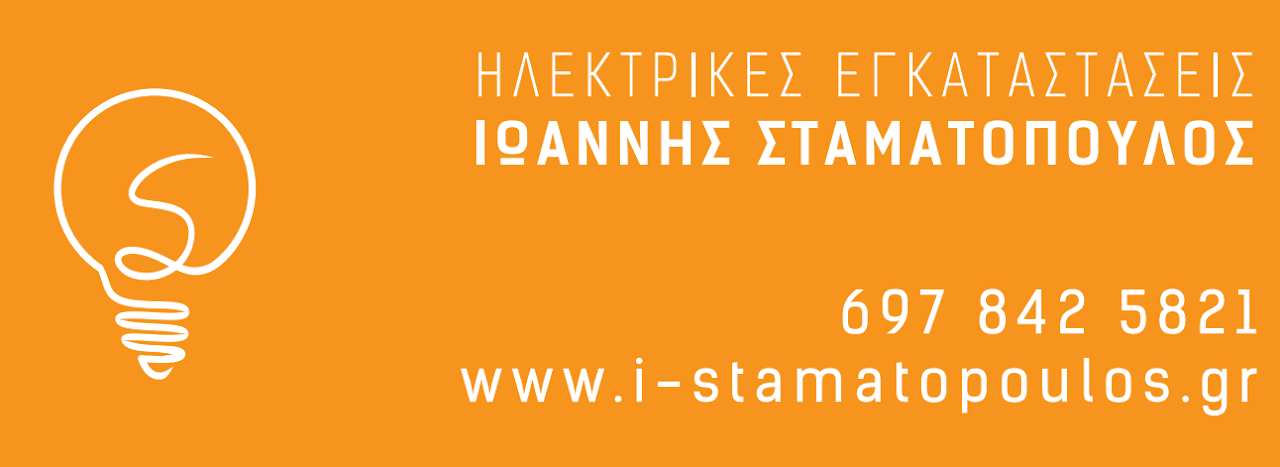
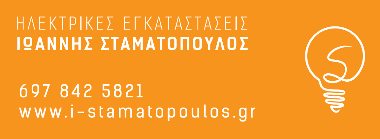
The bright orange background exudes energy and enthusiasm, creating a vibrant atmosphere. The white light bulb offers a striking contrast, enhancing the visual appeal and making the design pop. This combination of colors not only catches the eye but also conveys a sense of creativity and innovation, ideal for an electrician that wants to stand out.
Ligh bulb
The light bulb is an iconic symbol of ideas, innovation, and, of course, electricity. It serves as the perfect visual representation of an electrician’s work, embodying creativity, problem-solving, and technical expertise. The simple yet powerful image of the light bulb instantly connects with the audience, conveying a sense of professionalism and trust, essential for any electrical service.
Σ monoline
Inside the light bulb, I designed a “Σ”, which represents the electrician’s surname in Greek. This personalized detail adds a unique touch to the logo, making it not only a symbol of electricity but also a reflection of the individual’s identity. It strengthens the connection between the logo and the electrician, emphasizing professionalism and a personal touch that sets the business apart.
Owner's brief
The owner wanted a logo in orange colors—simple, minimal, yet easy to remember. The use of orange creates a vibrant and energetic feel, while the minimalist design ensures that the logo is clean and timeless. This balance of simplicity and memorability makes the logo not only visually appealing but also highly recognizable, which is key for any successful brand, especially for an electrician’s service.
EXTRAS:
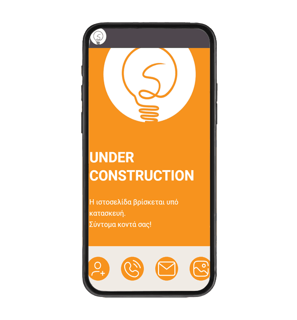
Business cards, Car wraps, Web app