PROJECT:
Stella Katsimperi
Physiotherapist
MAIN:
Logo Design
BRAINSTORMING:
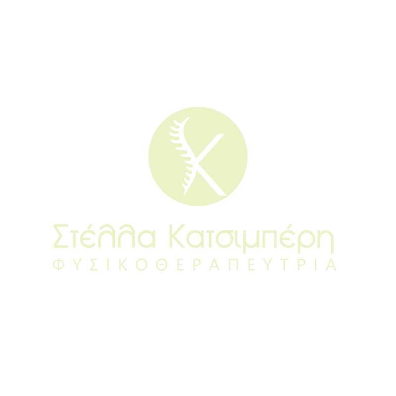
Color palette
The use of pastel blue and cream is soothing, often chosen by healthcare brands to evoke feelings of trust, calmness, and healing. These colors are inviting and create a sense of relaxation and care, which is especially important for a physiotherapist. Pastel blue represents tranquility and peace, while cream adds warmth and comfort. Together, they help build a welcoming environment where clients feel at ease and supported throughout their healing journey. This color combination not only enhances the overall aesthetic of a physiotherapist’s logo but also fosters a positive and nurturing atmosphere for recovery.
Symbolism of the Spine and Movement
The curved, segmented shape along the left side of the “K” resembles a spine. This design element creates a direct visual connection to physiotherapy, highlighting the focus on spinal alignment, health, and flexibility. The spine is a key component of physiotherapy treatments, and this subtle reference reinforces the expertise and services offered. By incorporating this shape, the logo not only represents the physical aspect of physiotherapy but also communicates a sense of balance and well-being, which are essential for healing and recovery.
Integration with the Letter K
The “K” represents the initials of the physiotherapist as a stylized monogram, helping to create a cohesive and distinctive identity. The spine flowing into the letter adds a unique, personalized touch to the design, making the logo not only memorable but also deeply connected to the physiotherapist’s last name. This combination of personal branding with the relevant imagery of physiotherapy reinforces trust and recognition, as clients will associate the logo with both the professional identity and the specialized care offered. It is a thoughtful way to build a strong, recognizable brand presence in the healthcare field.
Minimalistic design
The overall design is simple and uncluttered, adhering to modern design principles. This minimalistic approach eliminates unnecessary details, allowing the core message of health and alignment to take center stage. By focusing on these key elements, the logo remains versatile and easy to recognize across various media, from business cards to websites and social media. The simplicity of the design also ensures that it is easily scalable and adaptable, making it a timeless and effective visual representation of the physiotherapist’s services. This clarity not only helps in building brand recognition but also communicates professionalism and trustworthiness.
Owner's brief
The owner requested a minimal and pastel cozy style design that evokes trust and calmness. This design approach focuses on soft, soothing colors and clean lines to create a welcoming atmosphere. Pastel shades such as light blue, soft pink, and pale green are ideal for promoting relaxation, while the minimalistic style eliminates distractions, keeping the focus on the professional services offered. The overall effect is a peaceful, inviting environment that encourages clients to feel at ease and comfortable during their healing journey. This design not only reflects the physiotherapist’s expertise but also communicates a sense of care and tranquility.
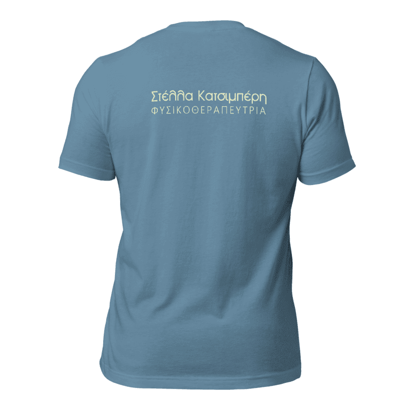
EXTRAS:
Merch