PROJECT:
REFILL
STATION SARAFIDI
MAIN:
Logo Design
BRAINSTORMING:
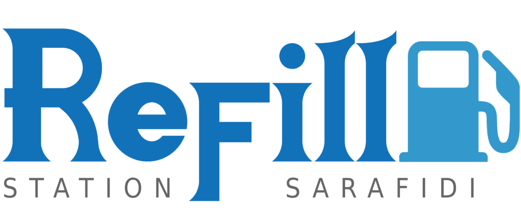
Why blue?
The choice of blue isn’t just about aesthetics; it’s a deliberate nod to the qualities associated with both water and cleanliness—key elements in the car wash experience. This color reinforces the sense of freshness and care we bring to every wash, while also connecting to the established and trusted identity of Elin Fuel Company. By using blue, we aim to create a seamless blend of reliable fuel services with a clean, professional car wash experience.
"Refill" wordmark
The prominent ‘ReFill‘ wordmark is the focal point of the logo, instantly communicating the business’s core service: refueling vehicles. The bold, stylized font injects a sense of energy and movement, capturing the dynamic, fast-paced environment of a gas station. This design choice not only reinforces the brand’s purpose but also creates a memorable, impactful visual that resonates with customers.
The gas pump
The fuel pump in a gas station’s logo serves as a direct and recognizable symbol of the services offered. It quickly communicates the primary purpose of the business—fueling vehicles—without the need for additional explanation. This visual cue is practical and memorable, helping customers immediately identify the brand’s main service while reinforcing trust and familiarity with a symbol they associate with refueling and convenience.
Owner's brief
The clients requested a clean and minimalist design to effectively showcase their gas station and car wash services. This approach not only highlights the main features of their business but also ensures a straightforward, user-friendly experience for customers. The design’s simplicity reinforces the primary services offered, emphasizing a professional, trustworthy atmosphere that aligns with the brand’s values.
EXTRAS:
Business cards
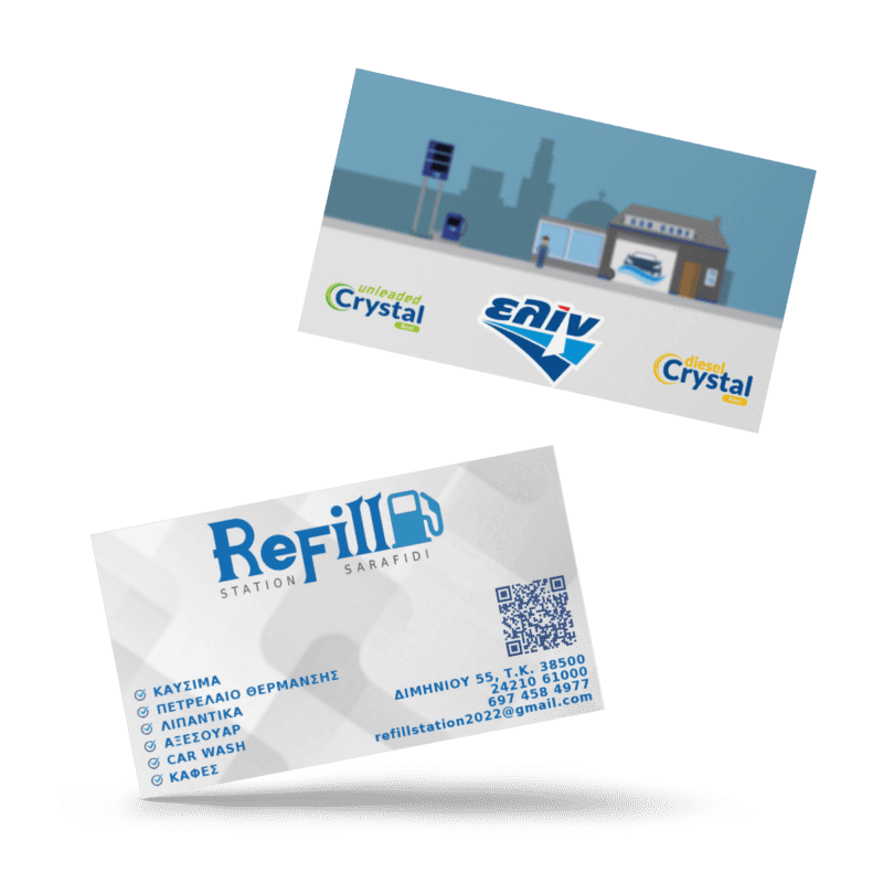
My approach was all about creating a professional, clean, and easy-to-read business card that instantly communicates the essentials. I focused on combining strong elements of the brand identity with clear service offerings and accessible contact details. This way, the design functions both as a powerful branding tool and a practical piece for customers, making it easy for them to understand what we offer and how to reach us.”
Web app
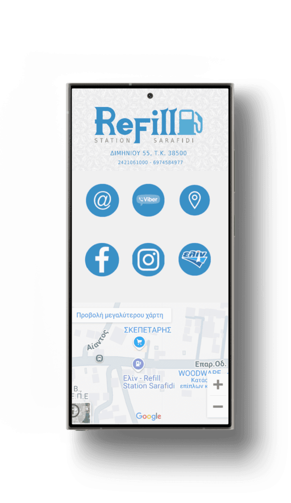
The web app is designed with a clean, minimalist approach, focusing on only the most essential information to quickly inform potential customers. This straightforward design is ideal for local businesses, especially gas stations, where simple navigation and easy access to contact options are crucial. By keeping things clear and intuitive, we ensure that customers can find what they need without any hassle, enhancing both usability and customer satisfaction.