PROJECT:
Fobe
handmade jewelry
MAIN:
Logo Design
BRAINSTORMING:
Color palette
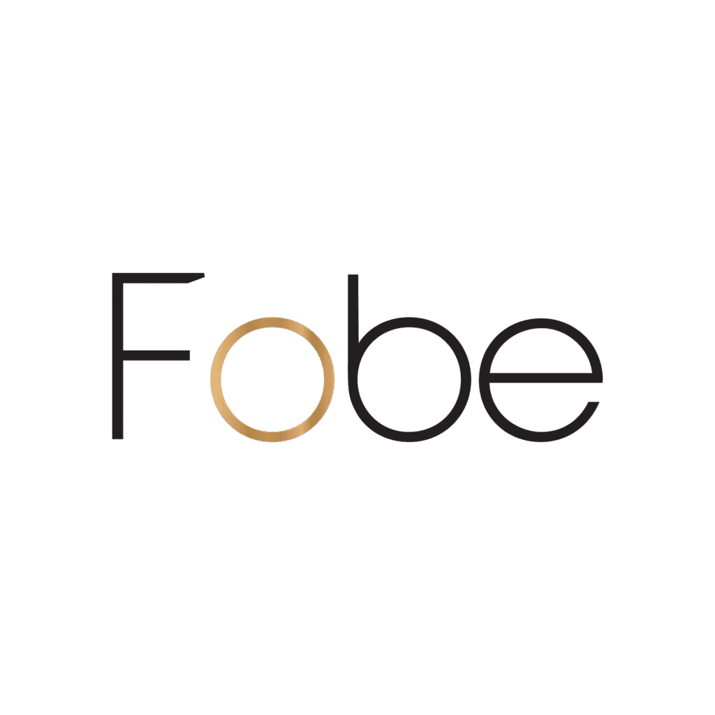
Black is timeless and professional. It gives the logo structure and clarity, making the brand name bold and easy to read.
Gold, used in the circular “o,” symbolizes the product itself — jewelry. It immediately evokes quality, value, and beauty. I used a gradient to give it depth, simulating a metallic surface.
Beige background softens the overall design, bringing warmth and a natural tone that subtly nods to the handmade aspect of the brand.
The overall palette balances luxury with warmth — perfect for a brand that’s both high-end and handcrafted.
The concept
The wordmark is built with a modern sans-serif typeface, chosen for its clarity and minimalist form. Each letter is carefully spaced for visual harmony.
A key concept was to make the letter “o” in Fobe unique:
I replaced it with a golden ring, which not only resembles an actual piece of jewelry but also becomes a visual hook for the brand. It can easily stand alone as an icon for packaging, social media, or stamps.For the tagline, “handmade jewelry”, I used a light, thin sans-serif font to contrast with the boldness of the brand name. It emphasizes delicacy and precision — qualities associated with handmade items.
Minimalistic design
The overall design is simple and uncluttered, adhering to modern design principles. This minimalistic approach eliminates unnecessary details, allowing the core message of health and alignment to take center stage. By focusing on these key elements, the logo remains versatile and easy to recognize across various media, from business cards to websites and social media. The simplicity of the design also ensures that it is easily scalable and adaptable, making it a timeless and effective visual representation of the physiotherapist’s services. This clarity not only helps in building brand recognition but also communicates professionalism and trustworthiness.
Owner's brief
The owner approached me to create a logo for their brand Fobe, which specializes in handmade jewelry. Their main request was for a logo that feels modern, elegant, and refined — something that communicates both the craftsmanship and the luxury of handmade jewelry. They wanted the brand name to stand out, but also requested a clean, minimal approach that reflects high-end aesthetics.
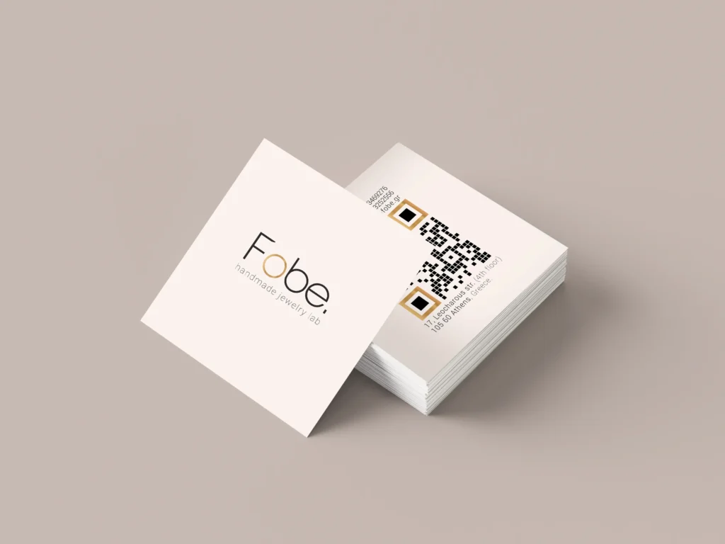
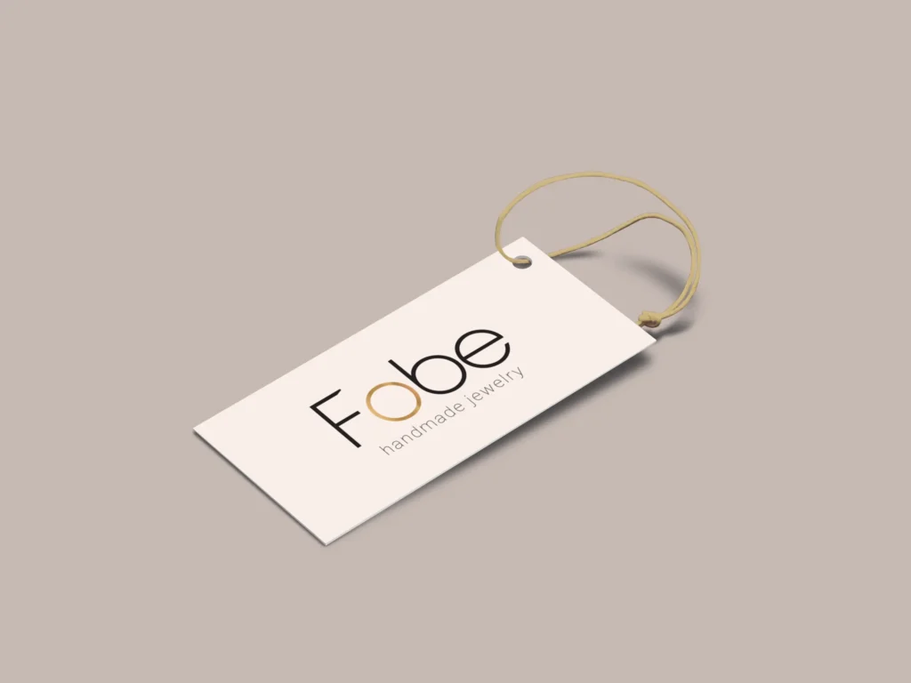
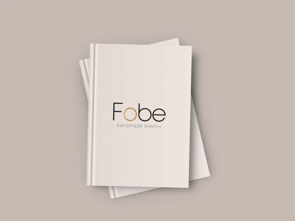
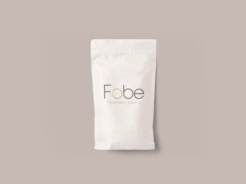
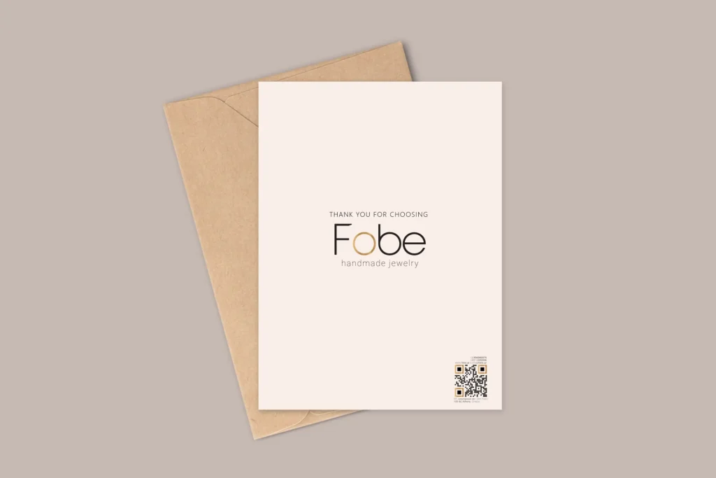
EXTRAS:
Merch