PROJECT:
KODRA TZIMIS
www.kodratzimis.gr
MAIN:
Logo Design

BRAINSTORMING:
Why blue?
Blue is an excellent choice for business branding because it helps create a professional yet approachable image. It perfectly aligns trust and reliability, which are at the core of the owner’s services. By incorporating blue into his branding, I convey a sense of confidence and dependability that clients can rely on.
Owner's brief
The owner of the business requested that we incorporate elements that reflect the construction industry and visually represent the services offered. This request was made to ensure the brand resonates with clients who are looking for expertise and reliability in construction. By adding relevant design elements, we created a visual identity that communicates strength, precision, and professionalism, key qualities in the construction field. This approach helps potential clients immediately understand the services available and establishes trust right from the first impression.
Tools
The inclusion of a circular saw, paint roller, level, and ruler in the design reinforces the idea of hands-on construction work. These tools are recognizable symbols of the trade, instantly connecting the brand with the construction industry. By incorporating these familiar elements, we emphasize the practical, skilled nature of the services offered. These tools not only reflect the craftsmanship involved in each project but also convey the professionalism and expertise that clients can expect from the owner’s work.
House icons
The two house icons in the background immediately establish the connection to construction and home improvement. Their inclusion helps reinforce the focus on residential projects and services. The different styles of the houses—one more detailed and the other simpler—suggest a broad range of services, from new builds to renovations. This visual contrast highlights the versatility of the services offered, showing that whether you’re looking to construct a brand-new home or renovate an existing one, Tzimis has the expertise to handle both with care and precision.
EXTRAS:
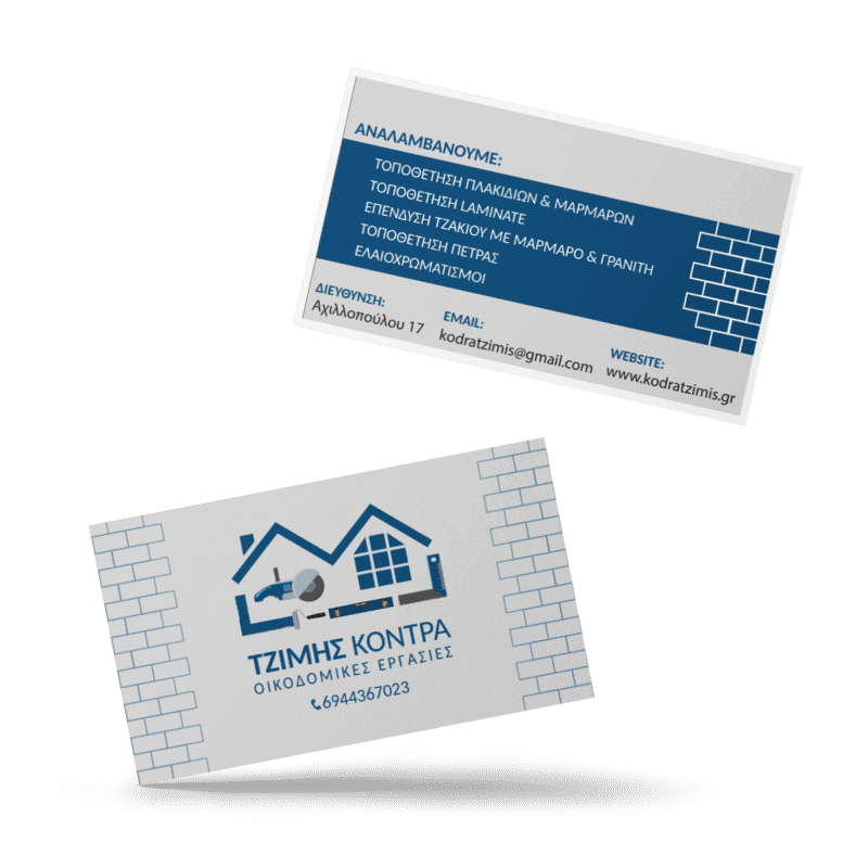
Business cards

My approach was focused on creating a design that effectively communicates the company’s services and contact information. I wanted the design to be not only visually appealing but also functional, ensuring that potential clients could easily understand what services are offered and how to get in touch. By focusing on clarity and simplicity, I made sure that the essential information stands out, making it easy for clients to reach out and learn more about the services offered.
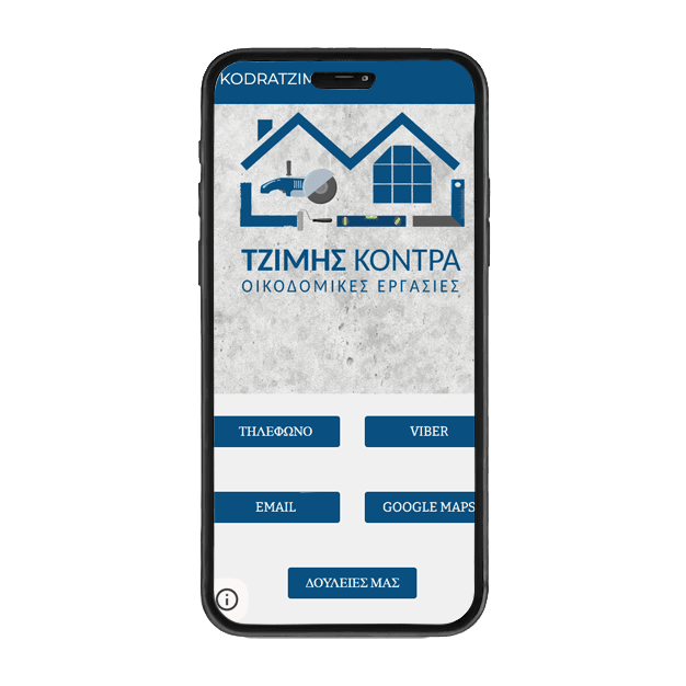
Web app

The web app I created is clean and minimalistic, yet functional and easy to navigate. I focused on ensuring that the design provides a smooth user experience, with intuitive navigation so visitors can easily find what they’re looking for. The company’s portfolio is included, showcasing the work they’ve done, along with useful information about the services offered. This approach helps potential clients quickly understand the quality of the company’s work and the expertise they bring to each project.