PROJECT:
CTRL
HARDWARE E-SHOP
MAIN:
Logo Design

BRAINSTORMING:
Why purple?
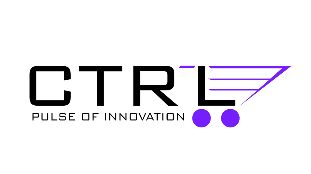
The use of black and purple creates a modern and sophisticated look. Purple is often associated with creativity, gaming, and innovation, which aligns perfectly with the brand’s message. This combination of colors helps the brand stand out, conveying a sense of originality and forward-thinking. It appeals to a young and dynamic audience, reinforcing the idea of innovation and creative energy.
Arrow & Shopping cart
The arrow-like element next to the “CTRL” symbol adds a dynamic feel, suggesting progress and forward movement. This design choice enhances the brand’s modern and innovative image. The cart icon, on the other hand, delivers a straightforward message about the company’s purpose, clearly communicating its focus on e-commerce or shopping. Together, these elements create a cohesive visual identity that resonates with a tech-savvy, action-driven audience.
Tagline
The tagline “Pulse of Innovation” reinforces the brand’s commitment to cutting-edge technology and innovation. It effectively communicates the company’s focus on staying ahead of the curve and constantly pushing the boundaries of what’s possible. This tagline resonates with audiences who value forward-thinking and are looking for the latest in technological advancements.
Owner's brief
He requested a logo that is both visually appealing and effective in conveying the brand’s message. The logo should capture the essence of the brand, combining creativity with clarity. It must be versatile, memorable, and easily recognizable, ensuring it resonates with the target audience and communicates the brand’s core values effectively.